


Trending Responsive Web Design
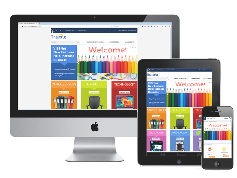
You want your website to look attractive and function properly, but as the use of portable devices accessing the Internet grows, it is more important to make sure that your site is equally functional and user friendly across all devices - smartphones, tablets, and desktops.
Responsive design will adapt to the device and browser used to view your site. You will receive improved website performance and superior search engine results. This also means that your customers will have a much better experience and keep coming back to buy from you.
Google Search Mobilegeddon
Google Search has updated its algorithm aimed at significantly changing the mobile search results to give preference to mobile ready web sites over non-mobile ready web sites. This change will have a significant impact in Google Search results on mobile devices. Users will find it easier to get relevant, high quality search results optimized for their devices.

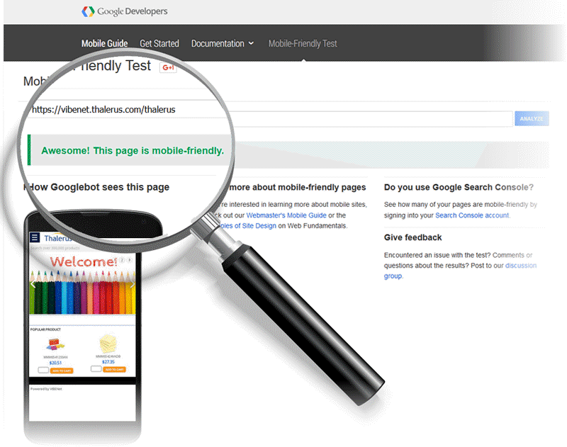
Is your site mobile friendly?
Do you know how Google Search sees your pages? Test your site's pages by using the Mobile-Friendly Test tool.
Having a mobile-friendly website is a prerequisite now! Mobile users are expecting an experience optimized for their device. Thalerus' responsive design tool will help you achieve optimize user experience on any device.